

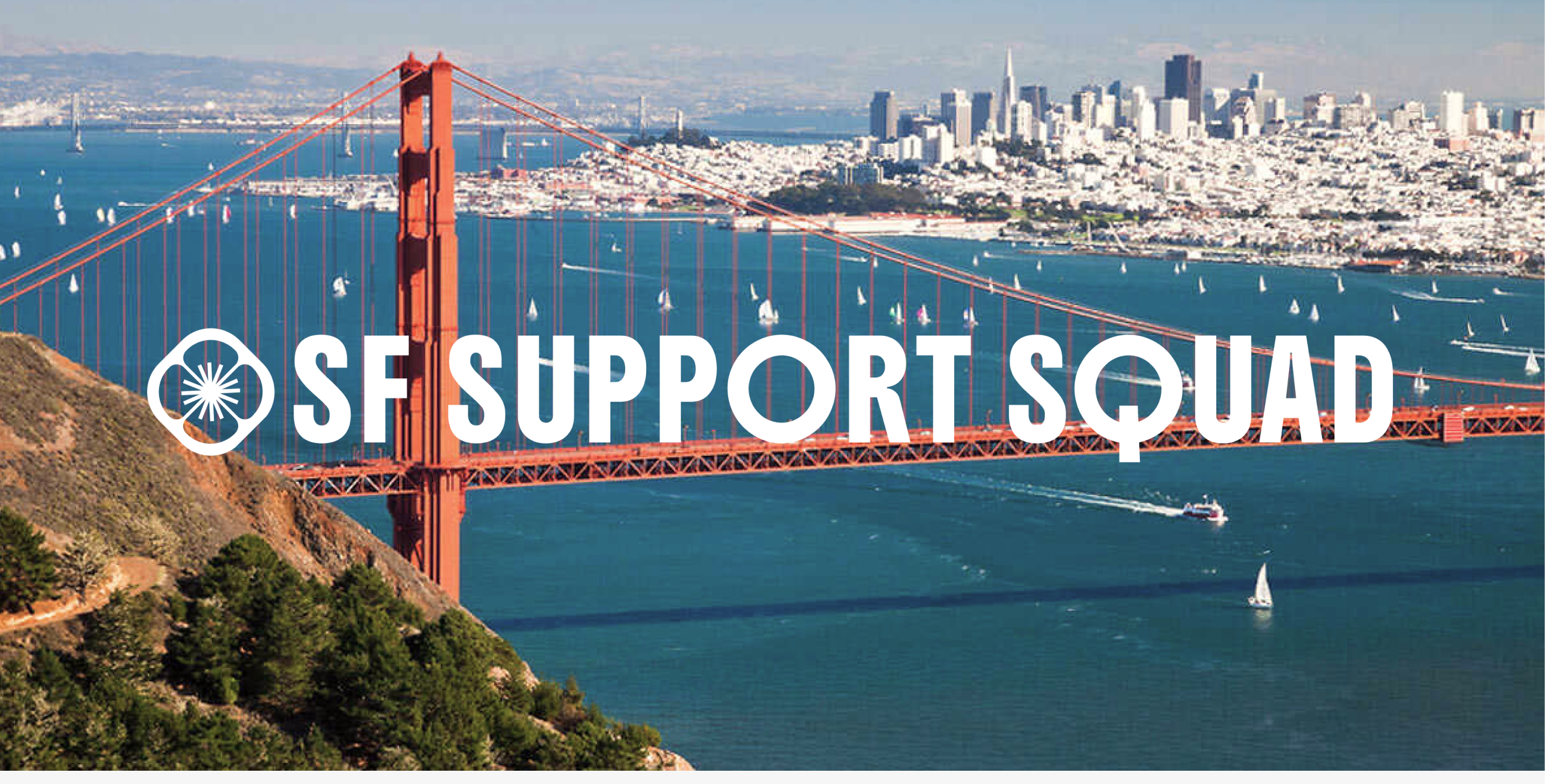
I developed a proposed brand identity that included logo concepts, color palettes, typography, and supporting visual assets. Although the organization ultimately chose to postpone branding efforts, the project highlights my process for creating a cohesive, mission-driven visual system grounded in clarity, trust, and approachability.
3 Weeks
Figma
Illustrator
Photoshop
Develop a professional and memorable logo that reflects the organization's mission and values.
Create a cohesive visual identity that builds recognition, credibility, and trust with donors, volunteers, and community partners.
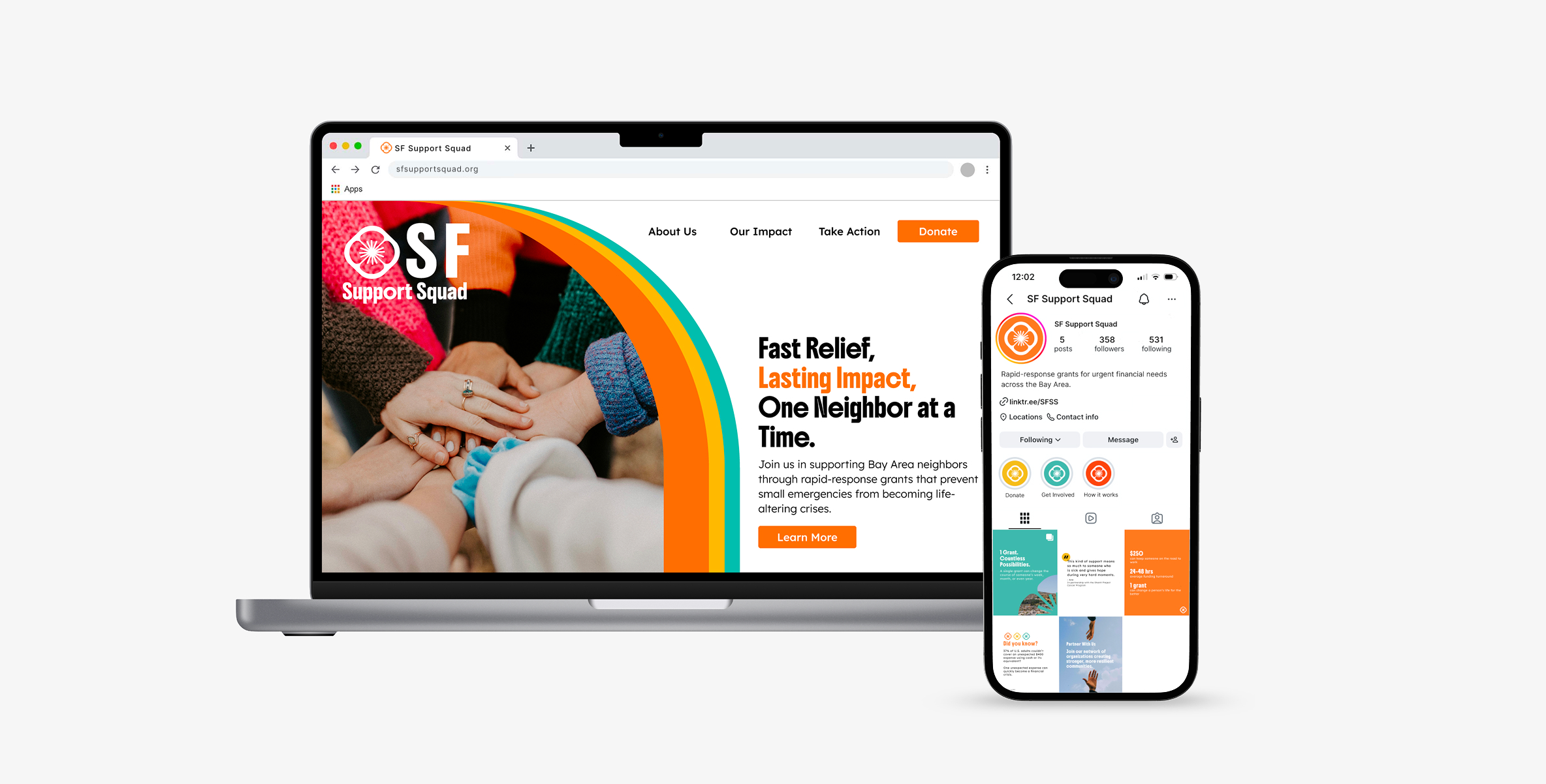
Designed to reflect warmth, trust, and community, the identity builds on SF Support Squad's existing orange with vibrant yellow and teal to create a hopeful and approachable visual system. A California poppy serves as the central mark, symbolizing resilience and the organization's California roots. Boldonse brings a confident presence to headlines, while Lexend ensures clarity and readability across all communications.

Together, these elements create a flexible identity that feels human, hopeful, and dependable across both digital and print touchpoints.
.png)
.png)
.png)
.png)
.png)
.png)
.png)
.png)
*This identity was developed as a proposed brand direction. Following a board review, the organization postponed branding efforts to prioritize other initiatives.