.png)
NuVue is a smart goggle and companion app system that helps skiers and snowboarders locate and reconnect with group members on the mountain. By using real time spatial awareness and intuitive visual cues within the goggle display, the experience reduces the stress of getting separated and makes coordinating on the slopes more seamless.
The project began with a broad idea of “Seamless Navigation for Skiers,” which our team developed into NuVue. As the UX Designer, I led the end to end design of the conceptual smart goggle and companion app, defining core features and guiding the team from ideation through interaction flows to create an experience that helps users locate and reconnect with their group on the slopes.
January 2025 -
May 2025
Figma
CapCut
Photoshop
Figjam
Mia Haake - UI/UX
Ben Arocho - ENGR
Alex Zhao - ENGR
Zane Rosche - ID
Zane Rosche - ID
Mona Agarwal - DEV
Renee Rust - PM
James Pinter- PM
Navigating the slopes with friends or family often leads to frustration with issues like getting separated, miscommunicating meetup spots, or losing track of each other entirely. Cell service can be unreliable, and shouting across trails isn’t exactly effective.
We reimagined how skiers and snowboarders coordinate with their group by designing an integrated smart goggle and companion app experience focused on clarity, real time awareness, and ease of use. Rather than relying on fragmented communication methods, the solution introduces intuitive visual cues and spatial guidance to help users quickly locate and reconnect with others in dynamic mountain environments. By prioritizing core coordination moments, we created a streamlined experience that reduces friction and keeps the focus on enjoying the time together.
.png)
Design an intuitive, low friction experience that works naturally within the skiing environment.
Improve real time group awareness without relying on inconsistent cell service.
Create a cohesive wearable and mobile system that simplifies coordination and reconnection.
While contributing to product ideation, prototyping, user research, and testing for the physical device, my primary role was designing the connected UI/UX experience. I focused on how the hardware and interface interact and influence one another, ensuring the overall system felt cohesive, intuitive, and seamless for users.
These walkthroughs focus on the spatial experience, but the product is designed as part of a broader ecosystem that includes the mobile app and connected goggles.


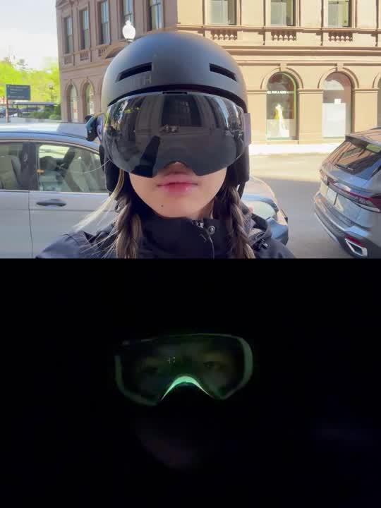

The LED light embedded in the track acts as a real-time guide, visually directing users toward others connected through the app. When paired with the goggles, these spatial cues are reinforced digitally, creating a seamless connection between the physical environment and the app-based system.
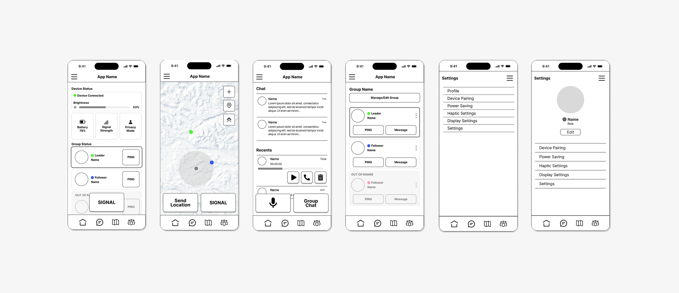
Users are guided through a quick intuitive setup process when first opening the app.
The smart goggles connect via Bluetooth with just a few taps, ensuring a fast and frustration-free experience.
Designed to be glove friendly, the home screen offers various functions to help the user navigate the slopes
SOS system designed to prevent accidental clicks
Search by username or scan a QR code to quickly add friends.
Customize colors from app and watch them appear on the smart goggles.
Remove friends from your list with a simple swipe or tap.
Due to project time constraints, our developer focused on implementing the core app functionality and ensuring seamless integration with the Smart Goggle prototype rather than completing the full feature set. The resulting build prioritized stability and real time interaction between devices, allowing us to validate the primary experience.
The final version, shown below, was distributed through TestFlight for continued development and testing.
To better understand our potential stakeholders, we sent out a survey to identify what users want, their experience, and potential areas of improvement. We got 69 responses, surprisingly, mostly from intermediate to expert level skiiers and snowboarders local to the Boston and Providence area.
We interviewed 15 ski and snowboarding enthusiasts, instructors, and industrial designers to understand user expectations. Participants consistently favored the HUD goggle concept for delivering glanceable, real-time information without disrupting the experience. These insights reinforced the HUD as the product’s key differentiator and guided the interface design to balance clarity, usability, and seamless integration with the physical form.
.png)
After gaining a deeper understanding of our users, we developed personas to ground our research and create a shared reference point for future decisions. These personas helped align stakeholders around the project’s direction and strengthened confidence in the strategic shift.

Mother of 2 Teenagers
Frequent skiier
Needs
To keep track of kids easily on busy slopes. Quick and reliable updates on location and safety.
Wants
Peace of mind while letting her kids ski independently. Simple interface with clear alerts.
Pain Points
Stress of losing sight of kids and them hurting themselves when she is not around.
.png)
Graduate Student
Avid skiier
Needs
Simple and easy ways to keep track of friends while skiing separately. Light and unobtrusive gear.
Wants
Ability to split up and easily regroup. Some privacy options when solo skiing. Cool, minimal tech that doesn’t feel bulky
Pain Points
Group getting separated constantly. Wasting time waiting or texting. Difficulty communicating on the move.
We compiled our research and developed a user journey map of the typical slope experience we hope to better and enhance through our products. It is in between steps 3 and 4 where our product would interfere and help users navigate back to group members.
.png)
Insight
HUD Goggles are the most popular form since they are a new experience and offer a unique value proposition.
People ski at different speeds and want to pursue their own runs, but still reconnect.
People want minimal, unobtrusive tech that doesn’t interfere with their skiing experience.
Implication
The design needs to prioritize and refine the HUD experience to maximize its unique value and user appeal.
The system should support dynamic regrouping without forcing synchronized movement.
The device and app should to be lightweight, seamless, and non-disruptive to preserve the skiing experience.
User insights informed a range of features prioritizing safety, situational clarity, and coordinated oversight. Ideas spanned from structured monitoring tools to intuitive real-time status updates.
.png)
Features were evaluated based on user impact and feasibility, helping us prioritize the most meaningful functionality within our timeline. As the product and app evolved together, we refined the scope by adding features that enhanced the core experience and removing those that no longer aligned with our goals.
Ultimately, we focused the interface primarily on navigation and safety, ensuring that every design decision supported the user’s ability to move confidently and stay protected on the slopes.
.png)
From there, I developed the information architecture and worked closely with the developer to create a cohesive, intuitive experience. We organized content in a way that felt natural for users while remaining realistic about scope, refining details along the way to keep the system clear and easy to navigate.
.png)
To better understand how the main functionalities would integrate with the physical product, I created wireframes that explored various functionalities and how they would potentially interact with the goggles. These concepts were tested with users to gather feedback, which helped clarify system relationships and informed iterations. Insights from this testing guided the development of the final prototypes, ensuring the experience was intuitive and aligned with user needs.
Using prototypes that demonstrated the product’s key functionalities, we gathered feedback to better understand user needs and behaviors. Below are the main insights that emerged from this testing.
Users felt that adding extra features like a chat or groups page made the app feel cluttered, emphasizing that simplicity and ease of use should remain the top priorities.
On-slope functions vs. off-slope functions should be clearly differentiated, ensuring that on-slope features are simple and designed for quick, easy use while off-slope functions can offer more detailed interactions like setting preferences.
The app should adjust its functionalities based on whether the goggles are paired, ensuring seamless use whether paired or not for those who opt to not buy the goggles.
As the project evolved, we consistently scoped down decisions to maintain focus on the core concept and avoid unnecessary complexity.
User testing with the app and goggles showed a clear preference for consistent simplicity, where users valued minimal, functional designs over feature-heavy ones.
Even if my designs weren't fully implemented, the process of prototyping, testing, and refining still provides valuable insights and growth as a designer.

.png)