

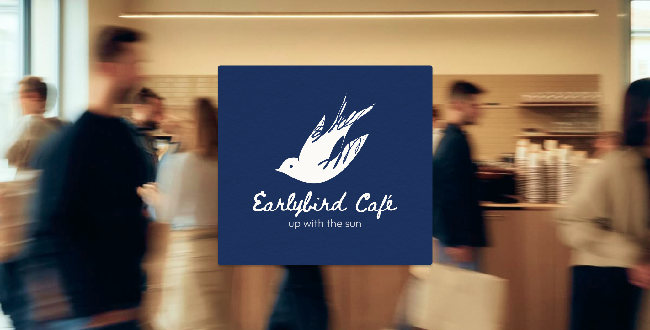
Earlybird is a contemporary neighborhood café designed for people with somewhere to be. Inspired by the rhythm of busy mornings, the café serves specialty coffee, ceremonial matcha, fresh pastries, and light breakfast bites in a space that feels welcoming, efficient, and thoughtfully designed. Whether it's the first stop before work, a quiet place to study, or a quick catch-up with friends, Earlybird celebrates the simple ritual of starting the day well.
2 Weeks
Figma
Illustrator
Photoshop
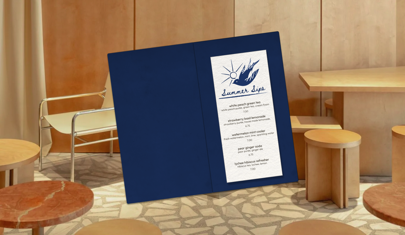
The visual identity captures the energy of mornings in motion through a clean editorial aesthetic, a calming palette of navy, cream, and soft blue, and playful bird illustrations that reinforce the brand name without overwhelming it. Modern typography, minimal layouts, and thoughtful details across menus, packaging, signage, and social media create a cohesive identity that feels approachable, refined, and built for everyday routines.
.png)
.png)
.png)
.png)
.png)

.png)
.png)
.png)
.png)
.png)
.png)
.png)
.png)